Kukusend
Industry:Fintech / Mobility
My Role:Product Designer
Deliverables:Landing Page Design
Year:2023
Sending Money, Made Effortless
KukuSend is a digital cross-border payment platform designed to make international money transfers simple, fast, and transparent. By supporting multiple currencies and countries, the platform eliminates traditional friction points such as hidden charges, long processing times, and complex transaction steps. The experience is built around clarity, trust, and ease of use across web and mobile.
My Role
I was the product designer responsible for KukuSend’s landing page and web app experience. While collaborating with another designer who led the mobile app, I owned the full web design process: structuring the user experience, creating wireframes, designing responsive interfaces, crafting user-facing content, and working closely with developers to bring it to life.
Key Contributions:
- User flow mapping
- Visual and interaction design
- Developer handoff in Figma
The Problem
The previous landing page presented KukuSend more like a gift-voucher service rather than a cross-border payment platform. It didn’t communicate the product’s core purpose, value proposition, or credibility for handling international money transfers. Users couldn’t immediately understand what the platform offered or trust it for sensitive transactions.
The redesign focused on repositioning the landing page to reflect KukuSend’s true identity: a fast, secure, and transparent cross-border payment platform. This involved clarifying the product’s value, highlighting its key features, and creating a more trustworthy and conversion-ready experience.
Core Issues
- Misaligned positioning: The previous landing page felt more like a gift-voucher service than a cross-border payment platform. Users couldn’t immediately understand the product’s purpose or value.
- Lack of visual clarity and hierarchy: Important information was difficult to find, making navigation confusing.
- No clear explanation of how the platform works: Users had to guess what KukuSend actually offered.
- Unclear target audience: It wasn’t obvious who the platform was for.
- Outdated or generic visuals: Design elements didn’t align with the brand’s tone or convey trust.
The redesign transformed KukuSend’s landing page into a clear, trustworthy, and user-friendly platform that shows what the product does, why it’s valuable, and encourages visitors to take action.
Research & Audience Understanding
To redesign the KukuSend landing page effectively, I first needed to understand how users perceived the existing page and where it fell short. Despite a strong backend and useful product features, the previous landing page didn’t clearly communicate what KukuSend was, who it was for, or how it worked. It lacked messaging clarity, user-centered language, and the visual cues that build trust in fintech platforms.
Through user interviews and reviews, it became clear that visitors often left the page unsure of the platform’s value. Some assumed it was only for businesses, while others couldn’t tell whether it supported international transfers or how secure it was. This confusion created unnecessary friction at the very first touchpoint.
These insights directly shaped my approach to content strategy, layout, and interaction design, ensuring the new landing page didn’t just look better, it spoke to users in a way that made them feel seen, informed, and confident.
Key user needs identified:
1. Clarity
Users needed to immediately understand what KukuSend does and who it’s meant for.
The old landing page was confusing; people weren’t sure if it was for businesses, personal use, or sending money internationally.
2. Trust signals
Because KukuSend handles money, users needed visual proof that it’s safe and legitimate.
Examples: security icons, testimonials, or professional design that feels credible.
3. Guided flows
Users needed clear directions on what to do next, how to explore features, understand the platform, or take the first step toward signing up.
The goal was to guide visitors toward the next action, creating an account, or learning more about KukuSend.
4. Friendly tone
Users preferred approachable, human language, not tech-heavy jargon or vague statements.
Makes the experience feel welcoming, not intimidating.
Strategy & Structure
To redesign the KukuSend landing page, I planned the user journey to move smoothly from first interest to action focusing on clarity, trust, and ease. The landing page was structured to help users instantly understand what KukuSend does, why it’s trustworthy, and how to get started.
Core selling points highlighted on the site:
- Fast, instant transfers: No wait times and a simple sign-up process
- No hidden fees: Users can transfer money without unexpected or maintenance charges
- Secure cross-border payments: Easy and safe transfers for users
The landing page showcased KukuSend’s key benefits through clear visuals, simple copy, and prominent calls-to-action, guiding users from understanding the product to trusting it and taking the next step toward signing up.
With those questions in mind, I structured the landing page into
clear, scrollable sections
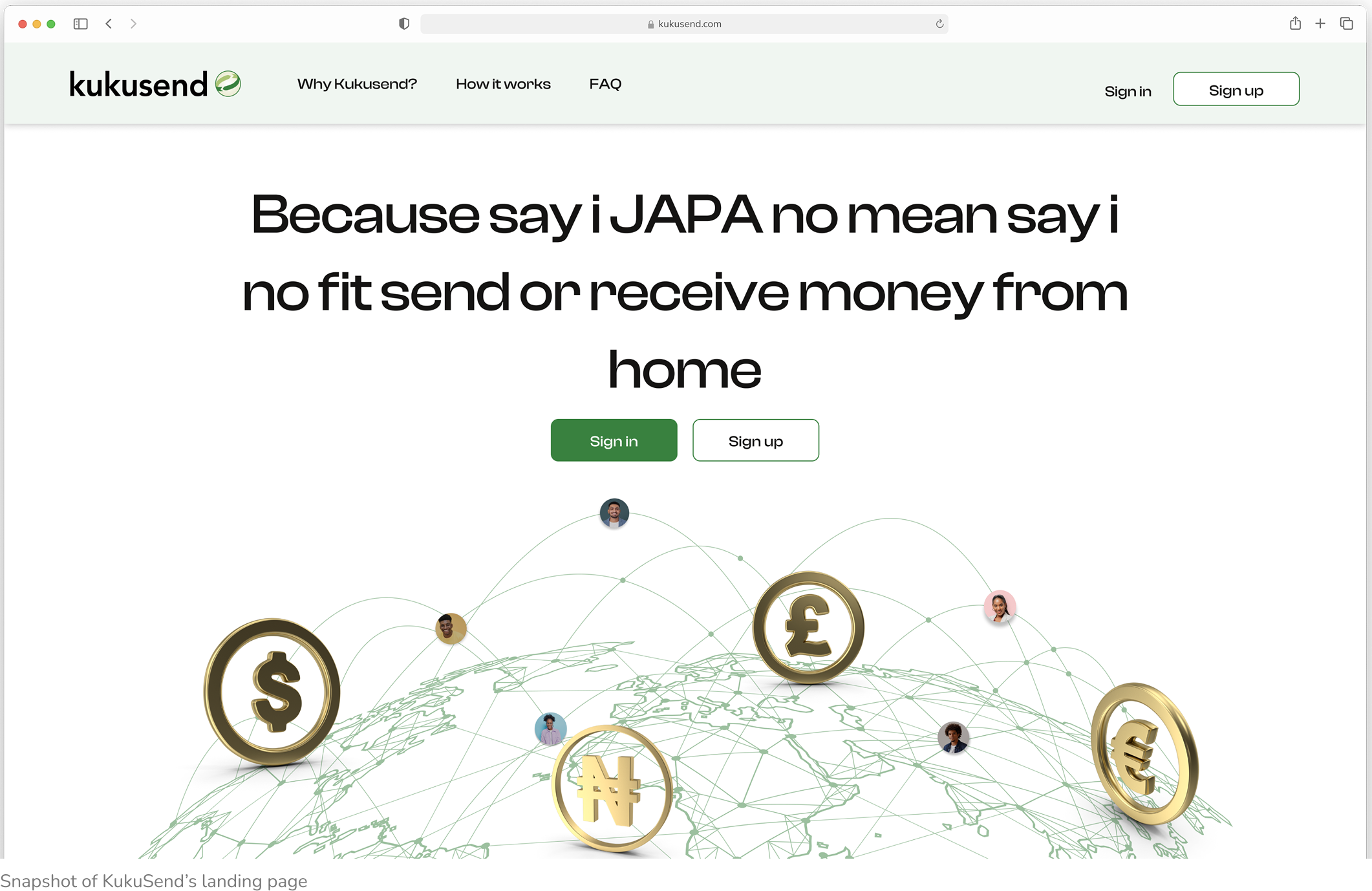
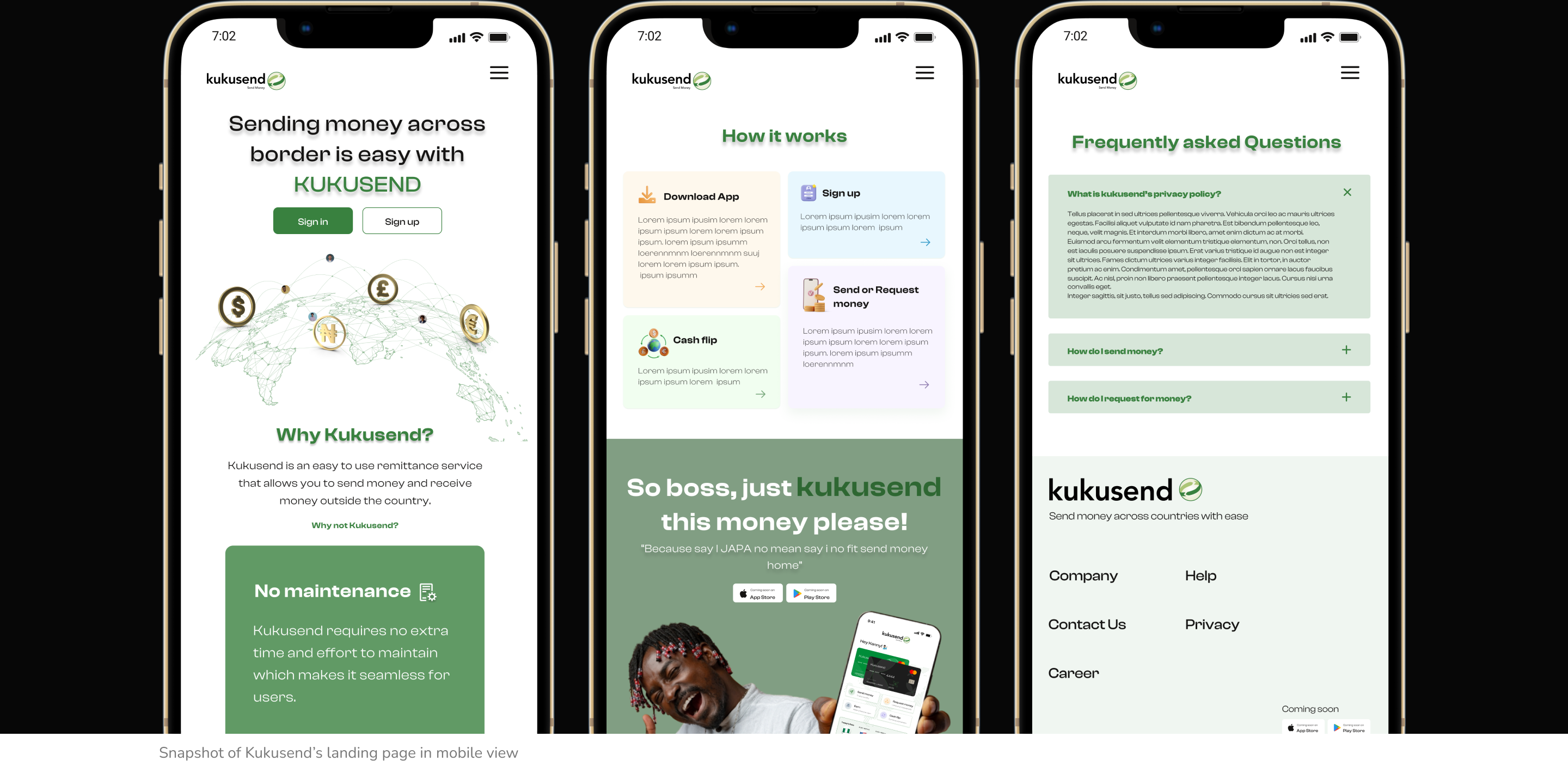
Simple Header
Simple Header
The page opens with a clean header, KukuSend’s logo, and clear CTAs “Sign In” and “Sign Up.” Minimal navigation keeps users focused on getting started.
Bold Hero Section
Bold Hero Section
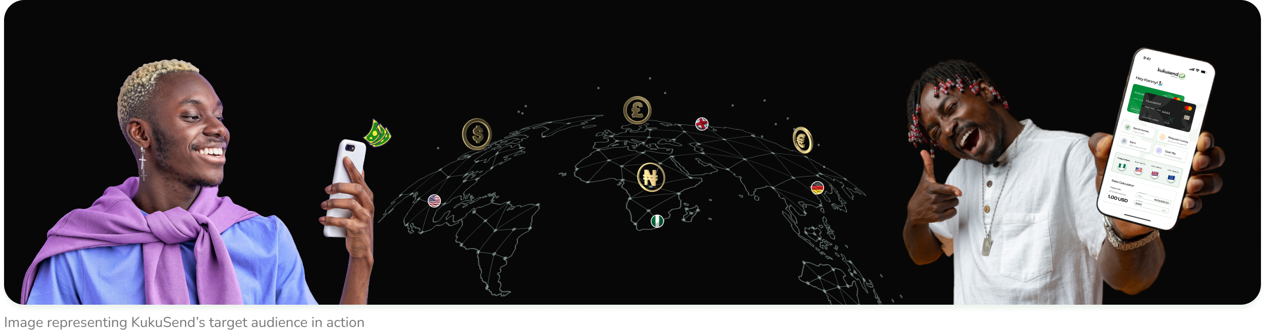
A clear headline, CTAs, and a friendly illustration work together to explain KukuSend and encourage action at first glance.
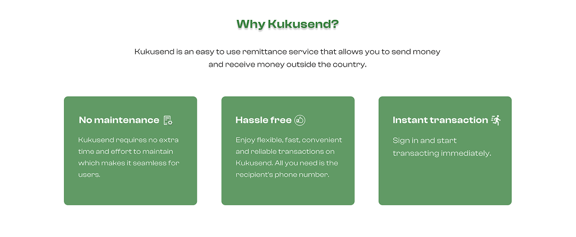
Key Benefits
Key Benefits
This section highlights KukuSend’s top perks: no maintenance fees, hassle-free transactions, and instant cross-border transfers paired with icons and brief descriptions for quick understanding.

How it Works
How it Works
This section simplifies the process into four clear steps: download the app, sign up, use Cash Flip if needed, and send or request money. It breaks down the experience into quick, intuitive actions making it easy even for first-time users.
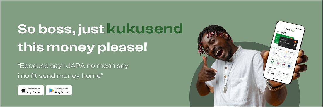
Tone-Setting Tagline
Tone-Setting Tagline
This section uses playful, culturally-rooted lines like “So boss, just kukusend this money please!” to connect with users emotionally. It adds warmth and relatability, reflecting the everyday language of the diaspora and making the experience feel natural, not transactional.
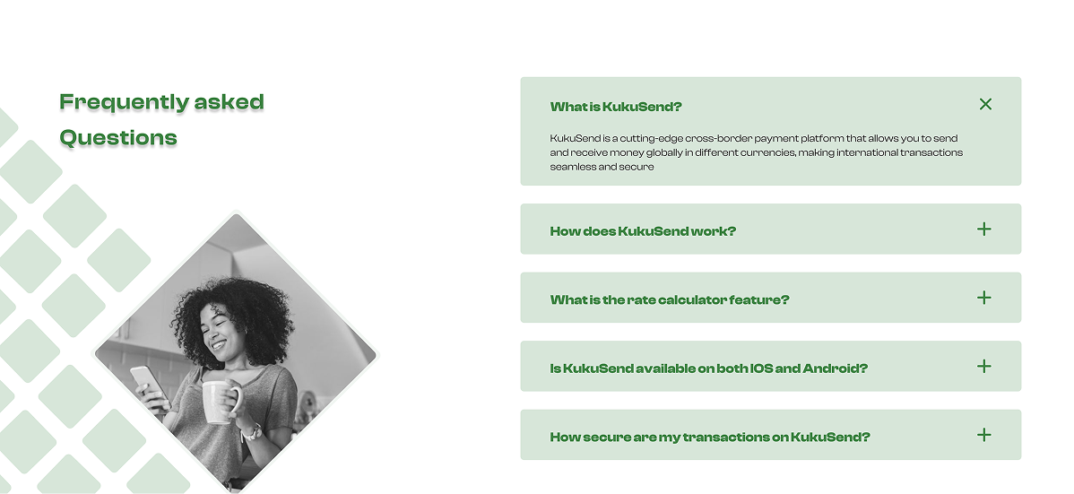
FAQs & Trust Reinforcement
FAQs & Trust Reinforcement
KukuSend’s FAQ section answers key questions about fees, security, and how the service works building trust through clear, direct responses.
Persistent CTAs Throughout
Persistent CTAs Throughout
Clear, action-driven buttons like “Sign In” and “Sign Up” appear across key sections, making it easy for users to take action at any point without scrolling back.
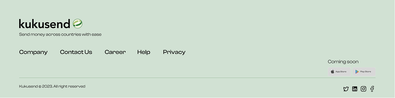
Confident Footer
The footer neatly wraps up the experience with links to terms, support, and social channels, leaving users informed and confident with a clear next step.
The footer neatly wraps up the experience with links to terms, support, and social channels, leaving users informed and confident with a clear next step.
Mobile-First Design
Knowing most users would access the site on mobile, I prioritized a responsive experience with sticky CTA buttons, tappable card layouts, lightweight illustrations, and smooth, fast-loading scroll behaviour.
Results
The redesigned landing page launched in 2024, driving higher engagement and more users signing up. The team appreciated how the new design simplified the product story and made KukuSend feel approachable, trustworthy, and secure.
Key Takeaways
Redesigning the KukuSend landing page came with a few valuable lessons:
Trust drives conversion: In fintech, clarity and credibility matter more than flashy visuals.
Visual structure matters: Thoughtful icons, layout, and hierarchy help users skim and quickly grasp key information.
Early collaboration pays off: Working closely with developers from the start ensures smooth handoff and faithful execution.